Style and Substance
LITERATOR
Role: visual DESIGNER | Timeline: 6 weeks, 2018 | Platform: WEBSITE
Overview
About LITERATOR
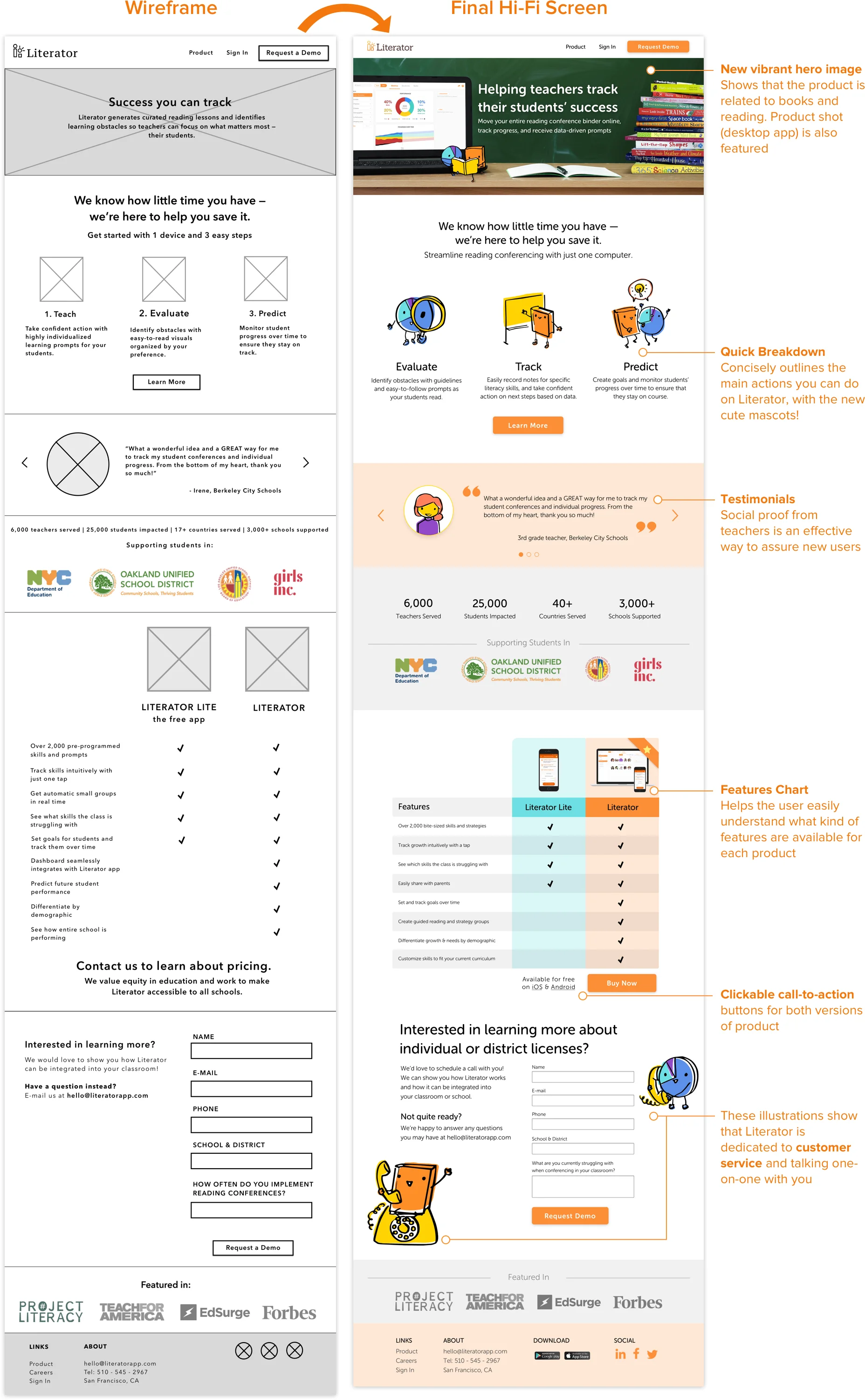
Literator is an online conferring binder that allows teachers to more efficiently track, evaluate and address student literacy needs.
CHALLENGE
The aim was to increase conversions & comprehension through user research and redesigning Literator’s marketing website to communicate Literator’s value to both teachers and administrators — leading to the number of demo requests per visit.
MY ROLE
I led the branding + UI team which produced the new typography guide, color schemes, UI components, and illustrations. I used Adobe Illustrator and Sketch.
Results
Research-Backed Rebrand — We created a successful research-backed and rebranded responsive web & mobile site that increased visitor engagement, responsiveness, acquisition, conversions, and overall site comprehension (measured by CTC, bounce rate, demo requests per site view, downloads per site view, and total downloads).


Before ———-> After

Process
Split into two teams, UX and UI. UX focused on testing comprehension of the existing site. UI delved into new color scheme and typography explorations.
CONCURRENT DESIGN
RESEARCH
Competitive Analysis
We looked into other ed-tech companies such as Lexia, Education.com, Kiddom, and ClassTag. Some elements we that we really liked were:
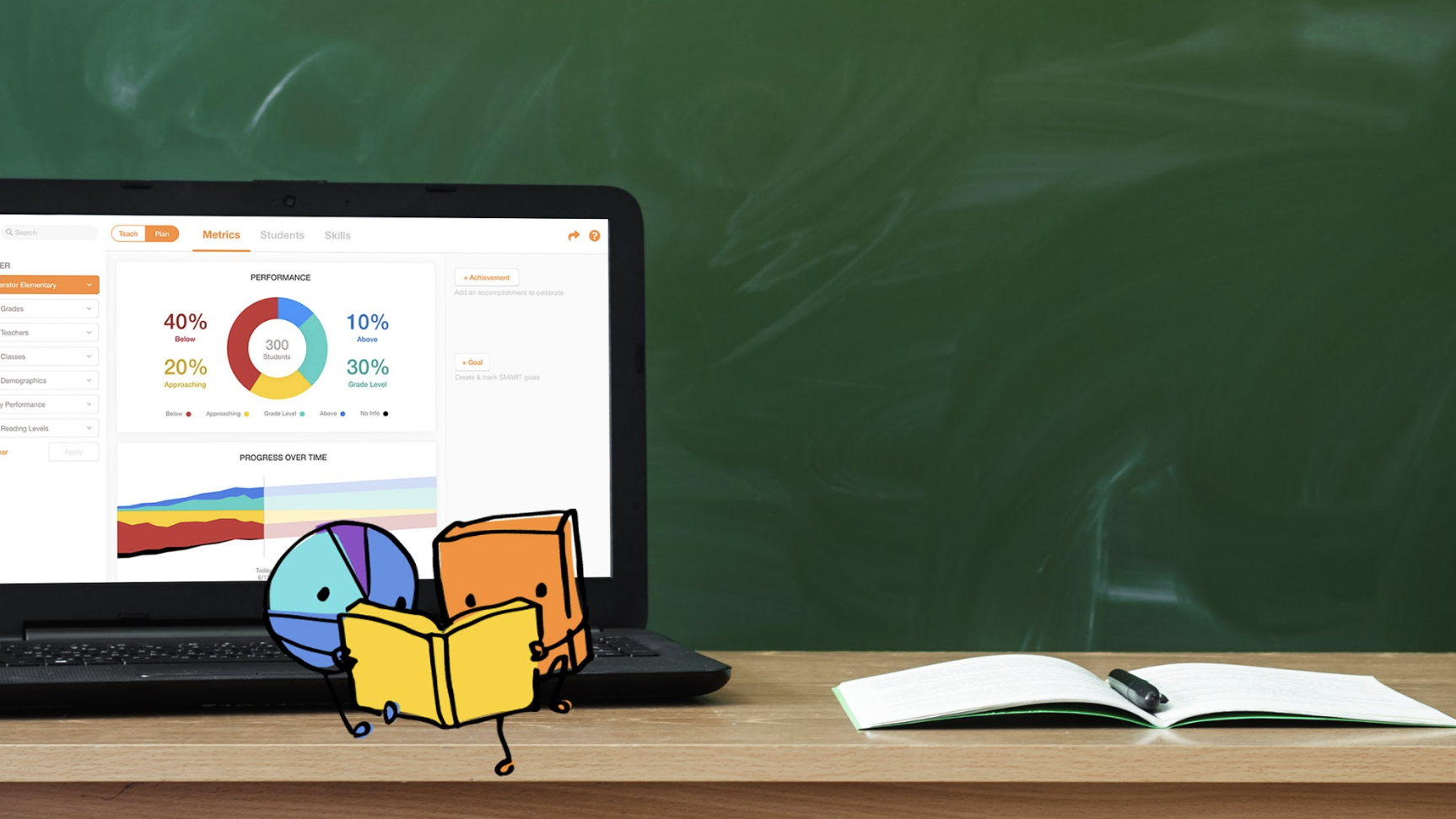
Friendly hero image
Testimonials
Clean, easy to read text
Bright primary/secondary color palette

Branding
BRANDING
Typography
Ideally, Literator would use the same font across its landing page and mobile + desktop app; however, the app currently uses Helvetica Neue, we wanted to be a bit more creative for the landing page! (Literator is working to incorporate the same font across its platforms.) I chose Museo Sans Rounded because it is versatile with its various weights, and has the “playful yet professional” brand words the clients were looking for. The rounded and bubbly features are not overdone.
Illustrations
As a group we decided that mascots would be a fun way to personify and add an element of play to the landing page. We explored several options, such as a bookworm, an owl, and other symbols of literacy and education before the client favorited our pie chart and book. I hand sketched each illustration and digitized it into color.