

Temporary Restraining Order Process: Simplified
EasyTRO
ROLE: Product designer | TIMELINE: 6 WEEKS, 2018 | PLATFORM: IOS MOBILE APP
Overview
About EasyTRO
An affiliate of the nonprofit AnnieCanons based in Alameda County, EasyTRO is a mobile app that helps survivors of domestic abuse understand their legal options, learn about the overall process of getting a temporary restraining order, and complete the DV-100 form.
CHALLENGE
The process of getting a restraining order (TRO) is bureaucratic and complex, both in filling out the form itself, and understanding the overall process of submitting the form to begin the official court process. This inaccessibility of resources creates a high rate of abandonment when added to the emotional challenges already present in the situation.
Our goal for this project was to simplify this exhaustive process by:
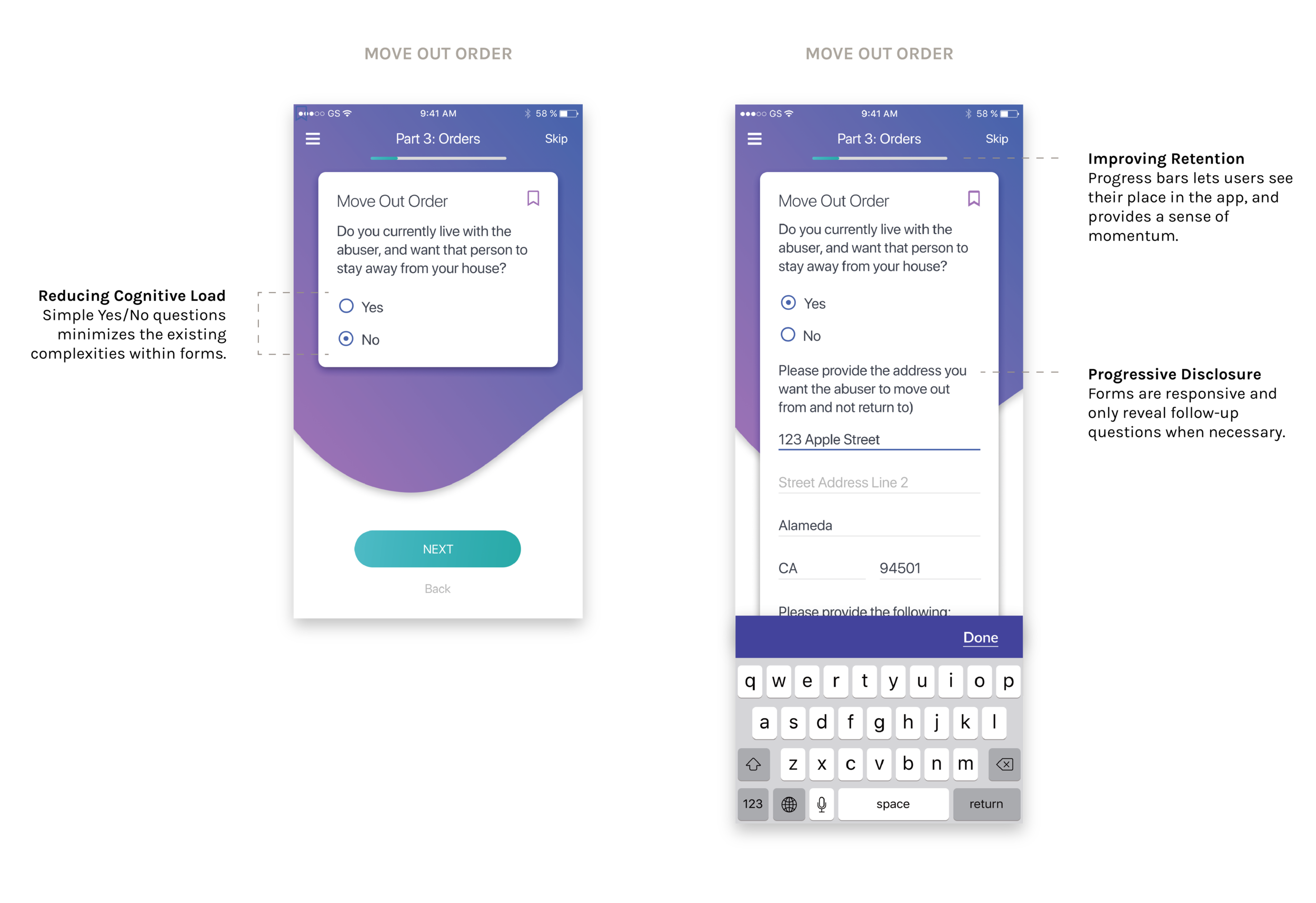
Breaking up the primary DV-100 form into a series of rephrased and digestible questions so that users can complete all mandatory paperwork within the app
Clearly communicating the legal process surrounding the restraining order process, including timeline, court dates, and appearance requirements
Supporting users with an accessible list of resources and guidance
MY ROLE
I worked on this project end-to-end, collaborating on UX and UI, branding, and interaction design. My primary objective was to ensure users knew how and where our app fit within the process of obtaining a temporary restraining order by implementing visual assets wherever relevant, and organizing information flow.
A Few Final Screens

Animations

Swipe Guide
Made with Principle, this swipe guide explains what the TRO kit actually is. Without the animations which portions of form-filling process our app would be helping out with.
TRO Kit Assembly Animation
This is a repeating load animation shows up after the user completes all their documents and is ready to receive them via email. Our app compiles these required files and packages them for delivery to the user’s inbox.

Results
Results
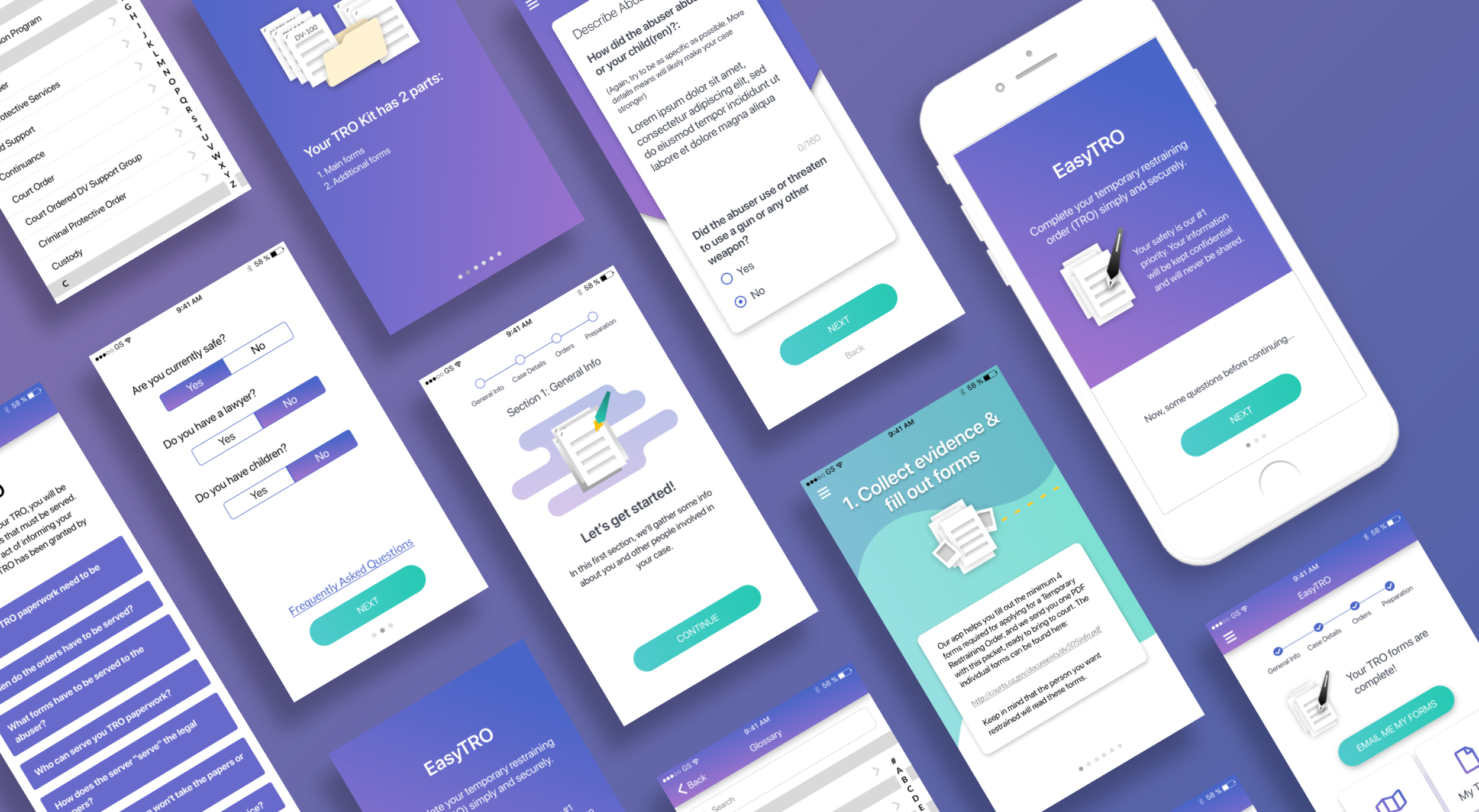
AnnieCannons is currently implementing our designs for a pilot program in Alameda County (expected launch period - Q1 2019). Below are a few screens of the final product.

Process
Design Process
Because this was an end-to-end app design, we concurrently built the brand style guide alongside the app design itself.

RESEARCH
Competitor Analysis
To start off our research phase, we looked at various services within the realm of our project scope, including similar informational, mission-driven, and form-filling tools. From these twelve websites and apps, we noted best practices around communicating sensitive emotional topics, from visual elements to voice and tone.

User Interviews
To gain a better understanding of this complicated and emotionally heavy experience, we interviewed 6 survivors of domestic abuse to understand the challenges they had both filing a TRO and filling out the TRO forms, specifically:
• What overwhelms users about the forms?
• What parts of the TRO process do users have the most trouble with?
• What confusion do users have before and after completing the forms?

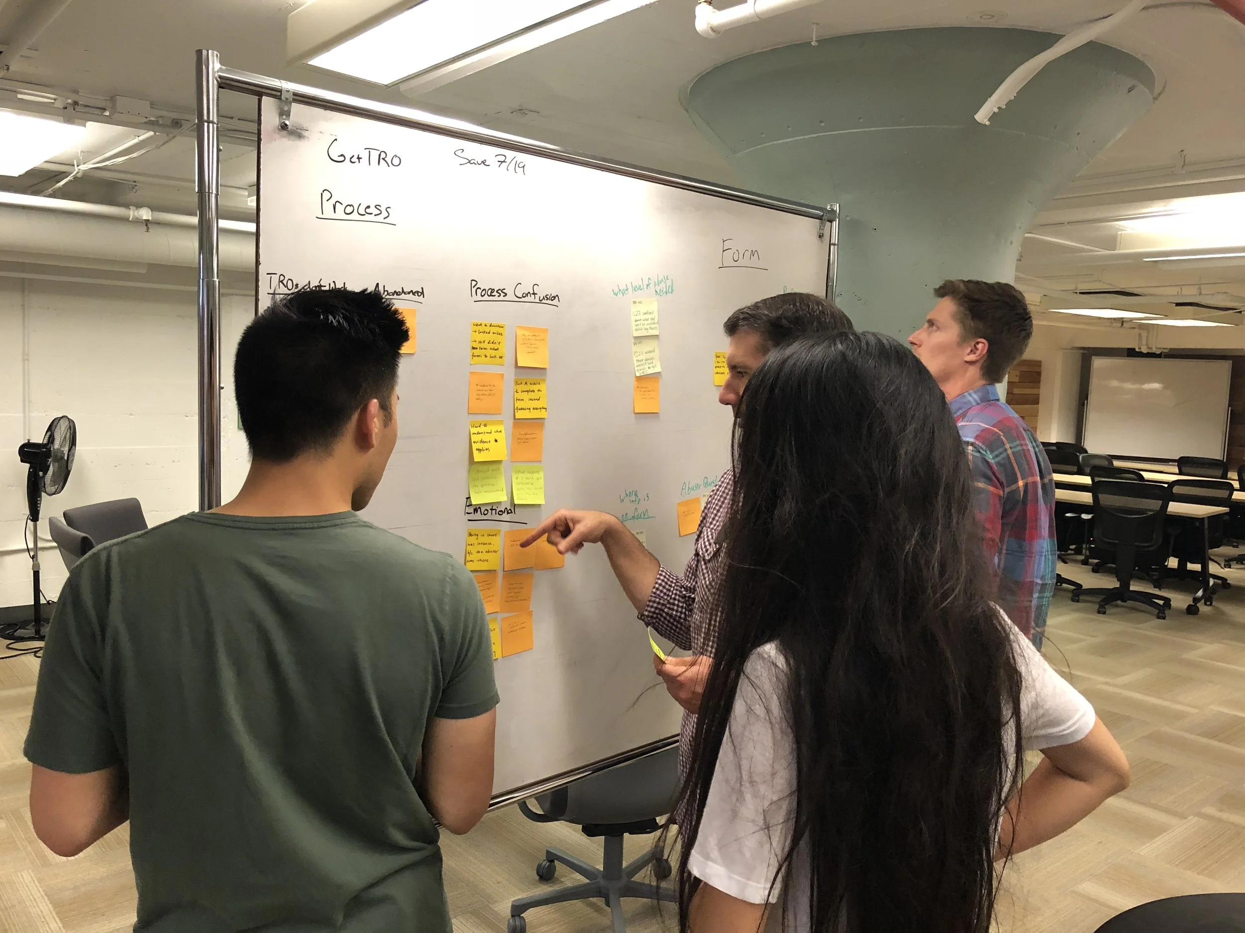
Key Findings
The insights from our user interviews shed light on a lot of pain points that we separated into process-related and form-related categories. We then brainstormed design solutions that we could realistically implement within our project timeline. We learned there were 3 major issues with the current TRO process:
Forms are time-consuming
Users spent a lot of time simply trying to understand the form questions which are full of legal terms and complex frame. Most users took over 3 hours to fill out the primary paperwork.TRO Process Confusion
Users were confused about which forms to fill out and who to give them to, even after consulting directly with court clerks.Emotionally Triggering
The TRO process made users feel incompetent and unsupported, on top of already having to recount traumatic experiences in detail.
Design
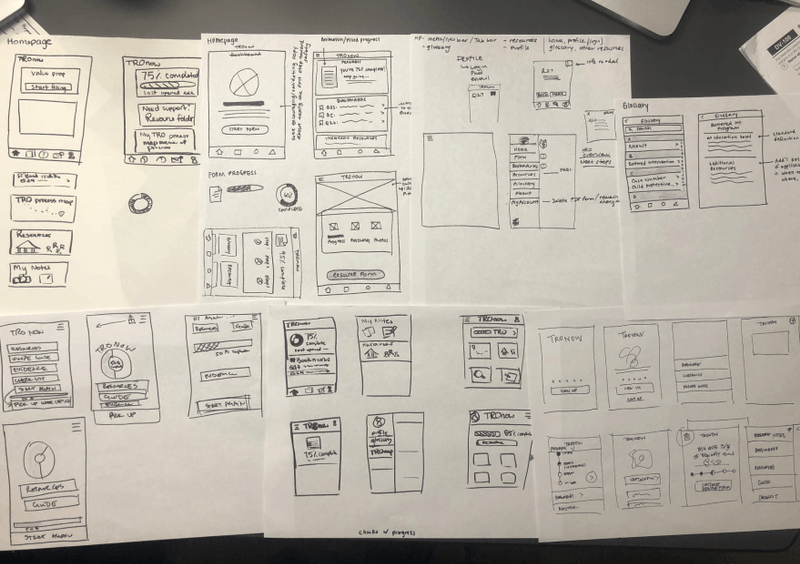
Design Studio
As a team, we held a design studio consisting of multiple rounds of Crazy 8 sketching to come up with as many solutions as possible for the homepage, progress bar, process roadmap, and question layout. After reviewing all of these options, we did a dot vote on sketches we wanted to bring into HiFi.
Form Design
The process of breaking up the form questions began with literally cutting up the form to discover a more logical flow that starts with general information, eases into more sensitive case details, that then transitions into any requested court orders and further preparation. Once redundant questions were eliminated, we split up the questions for each teammate to reword according to our predefined voice and tone guide.
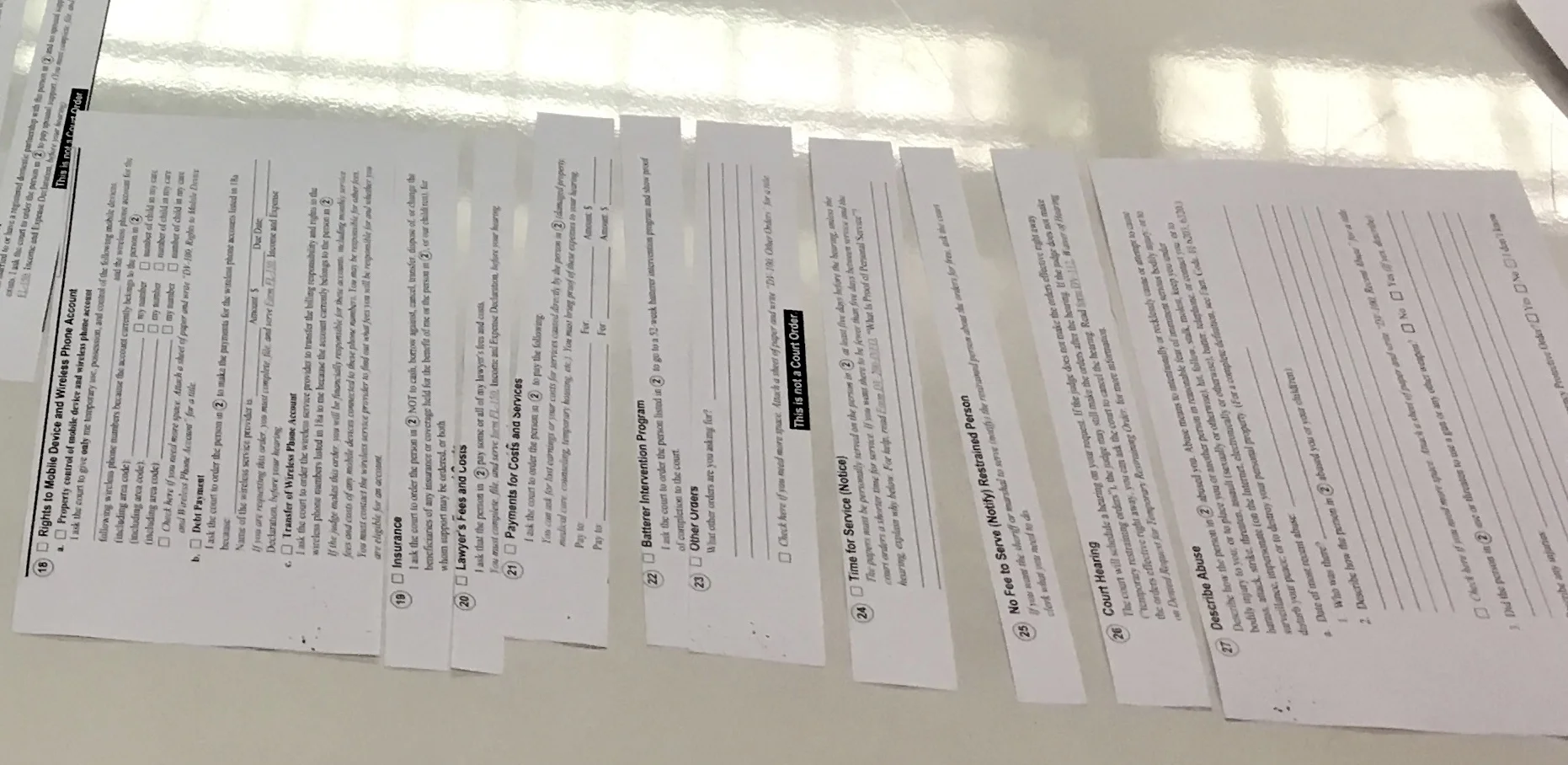
The actual content of the DV-100 form is bureaucratic and difficult to understand, and because of the highly legal nature of the content, we worked closely with two lawyers who were generous enough to advise on our rewordings. We worked in GoogleDocs and then presented the conditional questions in Jotform, an actual form-filling platform, so that we could run usability tests with the intent that actual users (survivors) would be able to have a completed form by the end of the usability and comprehension test.

Sketches to Sketch
Because the majority of the app consists of simple form fields, we translated our sketches straight into hi-fidelity. Our goal of creating an approachable and calming product relied heavily on effective UI and visual decisions.
Here is a sample of the design evolution of the form page throughout the hi-fi phase:
![TR_beforeAfter_metrics [Recovered]-20.png](https://images.squarespace-cdn.com/content/v1/54f44643e4b0565a8a7dd89d/1540860916399-4X3H5EI2XDMZGK23SEKK/TR_beforeAfter_metrics+%5BRecovered%5D-20.png)
Branding
I worked on a sub-team defining the app’s brand attributes and values, voice and tone, and visual elements. EasyTRO’s Our research showed that the TRO process is stressful, so we made sure our UI was calming by use of cool colors and gradients common amongst sleep and meditation apps, and used soft edges for our visuals. For typography, we chose a font that was both humanistic and legible.

Outcomes


EasyTRO Final Validation Testing
Evaluation
Usability Testing
We tested the app mainly for navigation and comprehension since recruiting survivors of domestic violence was a challenge, given the sensitive nature of TROs. Here were the results from our second round of testing:

In Closing
Next Steps
The client was extremely moved to see her idea finally come to life, and EasyTRO is currently being developed and will be tested initially in Alameda County. We provided recommendations to track form completion rates and the amount of people reaching out to customer support. Since our designs were MVP for the app, these metrics would provide a lot more tangible feedback for further iterations.
REFLECTION
A big challenge with this app was determining how to support users through a process that is so logistically complex and confusing, on top of already emotionally jarring. Designing with progressive disclosure was essential in minimizing information overwhelm for users, and this process required an incredible amount of empathy. A constant throughout this project was keeping user’s needs at the center, and being intentional in every design decision we made. I’m had the opportunity to work on such an impactful product as this.